20250126 모각코 활동 3회차
오늘의 목표 : 넘파이, 차트 공부 및 구현 (넘파이와 맷플롯립과 짱친되기)
NumPy?
Numerical Python : 파이썬에서 수치 계산을 빠르고 효율적으로 수행할 수 있도록 해주는 라이브러리.
( ?라이브러리 : 자주 쓰이는 코드들을 묶어놓은 도구상자. ex - PyTorch는 AI 모델을 만들 때 쓰는 도구상자같은것... )
주요 특징
- 빠른 연산 : C로 구현되어 있어 배열 연산 속도가 매우 빠르다
- 다차원 배열 지원
- 복잡한 데이터 표현이 가능해진다 ( 이미지 3D : 높이.너비.채널, 동영상 4D : 프레임 수.높이.너비.채널)
- 효율적인 연산이 가능해짐 -> 100개의 2D이미지를 처한다고 쳤을 때, 일반 Python 리스트로는 구조가 복잡해지고 느려짐. 하지만 다차원 배열을 사용하면 연산이 단순하고 빨라짐.
- 다양한 함수
- 배열 연산이 간편 : 반복문 없이 배열 전체에 대해 한 번에 연산 수행 가능 ( 벡터화 연산 )
import numpy as np( 보통은 np라는 이름으로 불러옴 )
배열 생성
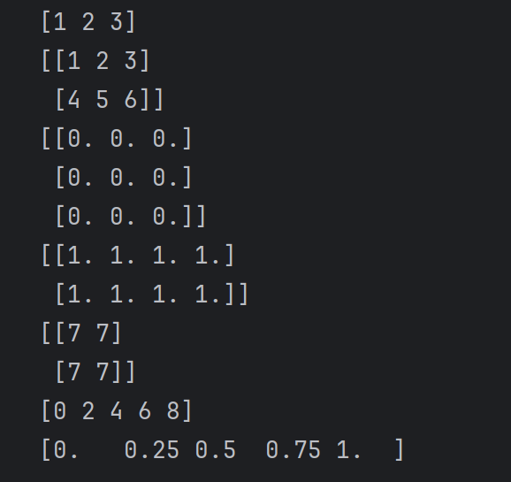
# 1D 배열
a = np.array([1, 2, 3])

# 2D 배열
b = np.array([[1, 2, 3], [4, 5, 6]])

# 0으로 채워진 배열
c = np.zeros((3, 3))

# 1로 채워진 배열
d = np.ones((2, 4))

# 임의의 숫자로 초기화된 배열
e = np.full((2, 2), 7)

# 연속된 숫자로 이루어진 배열
f = np.arange(0, 10, 2)  # [0, 2, 4, 6, 8]

# 균등 분할된 값
g = np.linspace(0, 1, 5)  # [0. , 0.25, 0.5 , 0.75, 1.]
배열 속성 확인
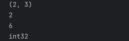
arr = np.array([[1, 2, 3], [4, 5, 6]])

print(arr.shape)  # 배열 형태 (2, 3)
print(arr.ndim)   # 차원 개수 (2D 배열이면 2)
print(arr.size)   # 전체 요소 개수 (6)
print(arr.dtype)  # 데이터 타입 (int32, float64 등)
인덱싱과 슬라이싱
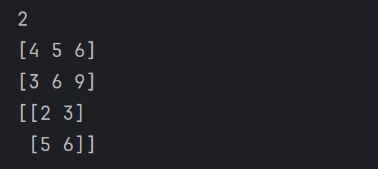
arr = np.array([[1, 2, 3], [4, 5, 6], [7, 8, 9]])

# 특정 요소 접근
print(arr[0, 1])  # 0번째 행, 1번째 열 (2)

# 행, 열 슬라이싱
print(arr[1, :])  # 1번째 행 전체 [4, 5, 6]
print(arr[:, 2])  # 모든 행의 2번째 열 [3, 6, 9]

# 범위 슬라이싱
print(arr[0:2, 1:3])  # 첫 두 행의 1~2번째 열 [[2, 3], [5, 6]]
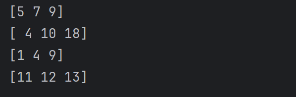
배열 연산
x = np.array([1, 2, 3])
y = np.array([4, 5, 6])

# 요소별 연산
print(x + y)  # [5, 7, 9]
print(x * y)  # [4, 10, 18]
print(x ** 2)  # [1, 4, 9]

# 스칼라와 연산
print(x + 10)  # [11, 12, 13]
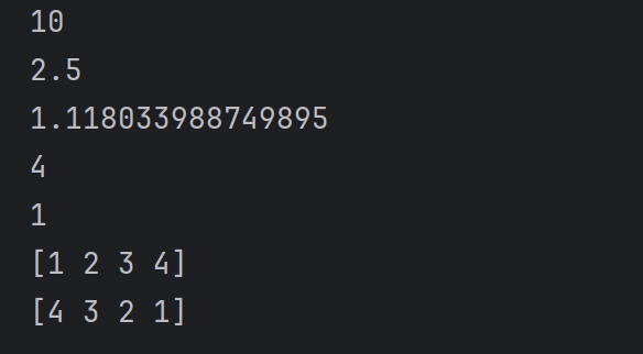
그 외 유용한 함수
arr = np.array([3, 1, 4, 2])

# 합, 평균, 표준편차, 최댓값, 최솟값
print(np.sum(arr))  # 10
print(np.mean(arr))  # 2.5
print(np.std(arr))  # 표준편차
print(np.max(arr))  # 4
print(np.min(arr))  # 1

# 오름차순 정렬
print(np.sort(arr)) # [1, 2, 3, 4]
# 내림차순 정렬
print(np.sort(arr)[::-1]) # [4, 3, 2, 1]
배열 변환
arr = np.array([[1, 2], [3, 4]])

# 배열 형태 변경
reshaped = arr.reshape(4, 1)
print(reshaped)
# [[1]
#  [2]
#  [3]
#  [4]]

# 전치 (Transpose)
print(arr.T)
# [[1 3]
#  [2 4]]

# 1차원으로 펼치기
flattened = arr.flatten()
print(flattened)  # [1, 2, 3, 4]
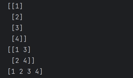
차트 ( matplotlib )
Python에서의 데이터 시각화를 위한 라이브러리
주요 특징
- 다양한 시각화 제공 : 간단한 선 그래프, 막대 그래프, 히스토그램부터 복잡한 3D 그래프까지 다양한 시각화를 제공함.
- 보통
matplotlib.pyplot모듈을 통해 그래프를 그림. - 보통
import matplotlib.pyplot as pltplt라는 이름으로 불러옴.
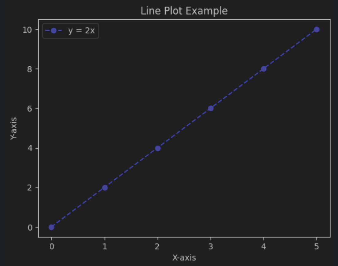
선 그래프 Line Plot
# 데이터
x = [0, 1, 2, 3, 4, 5]
y = [0, 2, 4, 6, 8, 10]

# 선 그래프 시각화
plt.plot(x, y, label="y = 2x", color="blue", linestyle="--", marker="o")
plt.title("Line Plot Example")  # 그래프 제목
plt.xlabel("X-axis")  # x축 이름
plt.ylabel("Y-axis")  # y축 이름
plt.legend()  # 범례 추가
plt.show()  # 시각화
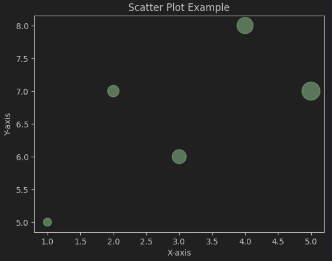
산점도 그래프 Scatter Plot
# 데이터
x = [1, 2, 3, 4, 5]
y = [5, 7, 6, 8, 7]
sizes = [100, 200, 300, 400, 500]

# 산점도 시각화
plt.scatter(x, y, s=sizes, color="green", alpha=0.6)
plt.title("Scatter Plot Example")  # 제목
plt.xlabel("X-axis")  # x축 이름
plt.ylabel("Y-axis")  # y축 이름
plt.show()  # 시각화
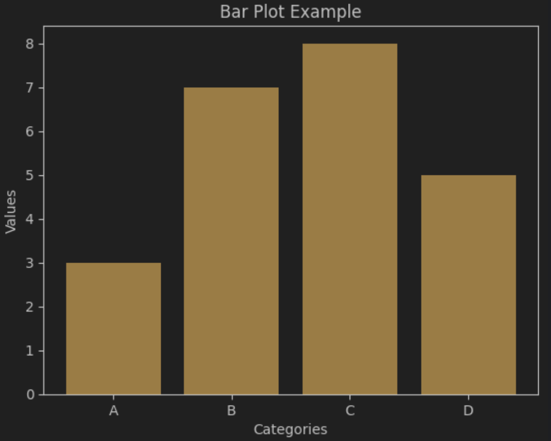
막대 그래프 Bar Plot
# 데이터
categories = ['A', 'B', 'C', 'D']
values = [3, 7, 8, 5]

# 막대 그래프 시각화
plt.bar(categories, values, color="orange")
plt.title("Bar Plot Example")  # 제목
plt.xlabel("Categories")  # x축 이름
plt.ylabel("Values")  # y축 이름
plt.show()  # 시각화
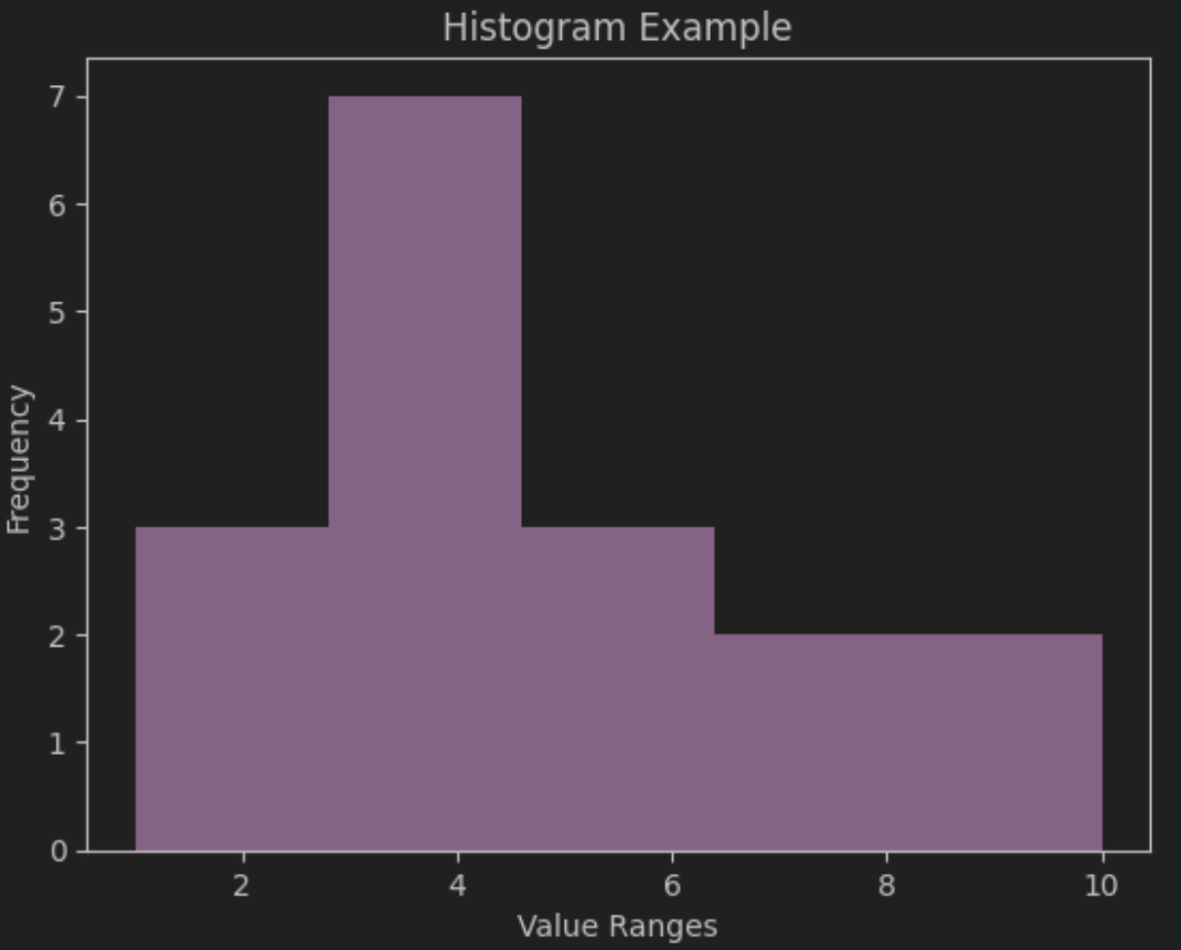
히스토그램 Histogram
# 데이터
data = [1, 2, 2, 3, 3, 3, 4, 4, 4, 4, 5, 5, 6, 7, 8, 9, 10]

# 히스토그램 시각화
plt.hist(data, bins=5, color="purple", alpha=0.7)
plt.title("Histogram Example")  # 제목
plt.xlabel("Value Ranges")  # x축 이름
plt.ylabel("Frequency")  # y축 이름
plt.show()  # 시각화
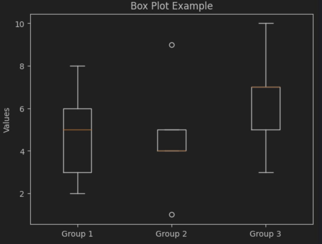
박스 그래프 Box Plot
# 데이터
data = [
    [2, 3, 5, 6, 8],  # Group 1
    [1, 4, 4, 5, 9],  # Group 2
    [3, 5, 7, 7, 10]  # Group 3
]

# 박스 플롯 시각화
plt.boxplot(data, tick_labels=['Group 1', 'Group 2', 'Group 3'])  ## tick_labels -> 이전에는 labels로 쓰임
plt.title("Box Plot Example")  # 제목
plt.ylabel("Values")  # y축 이름
plt.show()
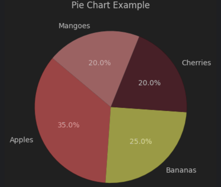
원형 차트 Pie Chart
# 데이터
labels = ['Apples', 'Bananas', 'Cherries', 'Mangoes']
sizes = [35, 25, 20, 20]

# 파이 차트 시각화
plt.pie(sizes, labels=labels, autopct='%1.1f%%', startangle=140, colors=['red', 'yellow', 'pink', 'brown'])
plt.title("Pie Chart Example")  # 제목
plt.show()  # 시각화
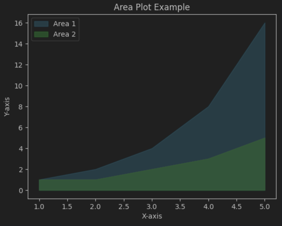
면적 그래프 Area Plot
# 데이터
x = [1, 2, 3, 4, 5]
y1 = [1, 2, 4, 8, 16]
y2 = [1, 1, 2, 3, 5]

# 면적 그래프 시각화
plt.fill_between(x, y1, color="skyblue", alpha=0.5, label="Area 1")
plt.fill_between(x, y2, color="lightgreen", alpha=0.7, label="Area 2")
plt.title("Area Plot Example")  # 제목
plt.xlabel("X-axis")  # x축 이름
plt.ylabel("Y-axis")  # y축 이름
plt.legend()  # 범례 추가
plt.show()  # 시각화
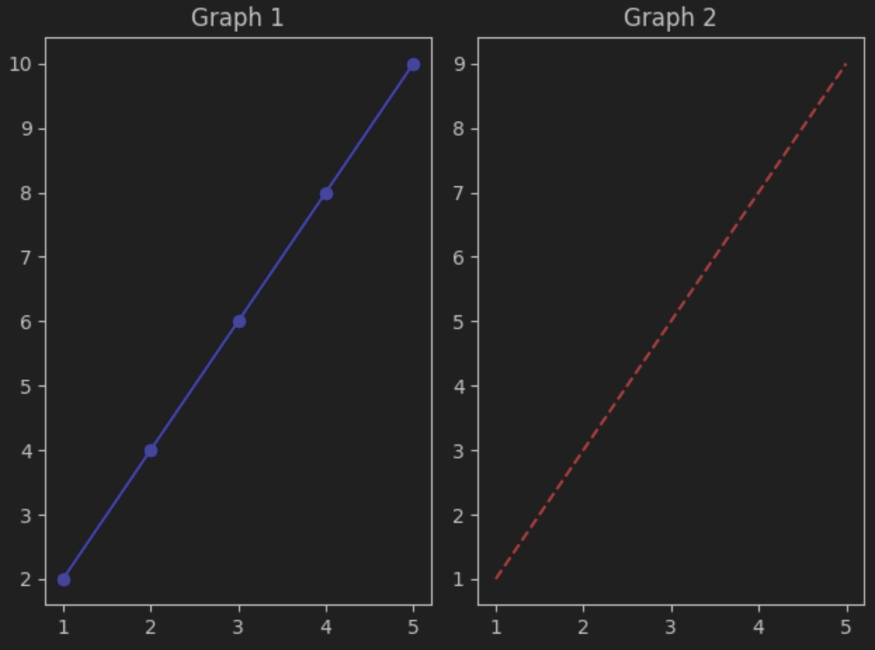
다중 그래프 SubPlots
# 데이터
x = [1, 2, 3, 4, 5]
y1 = [2, 4, 6, 8, 10]
y2 = [1, 3, 5, 7, 9]

# 다중 그래프 시각화
plt.subplot(1, 2, 1)  # ( 1행 2열 )plt.plot(x, y1, color="blue", marker="o")  # 첫 번째 그래프
plt.title("Graph 1")  # 첫 그래프 이름

plt.subplot(1, 2, 2)
plt.plot(x, y2, color="red", linestyle="--")  # 두 번째 그래프
plt.title("Graph 2")  # 두 번째 그래프 이름

plt.tight_layout()  # 간격 조정
plt.show()  # 시각화
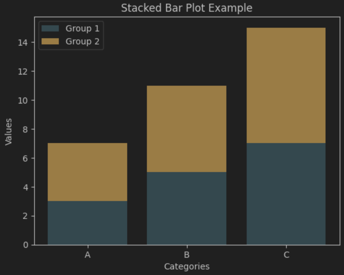
스택형 막대 그래프 Stacked Bar Plot
# 데이터
categories = ['A', 'B', 'C']
group1 = [3, 5, 7]
group2 = [4, 6, 8]

# 스택형 막대 그래프 시각화
plt.bar(categories, group1, label="Group 1", color="lightblue")
plt.bar(categories, group2, bottom=group1, label="Group 2", color="orange")  # 스택 쌓기
plt.title("Stacked Bar Plot Example")  # 제목
plt.xlabel("Categories")  # x축 이름
plt.ylabel("Values")  # y축 이름
plt.legend()  # 범례 추가
plt.show()  # 시각화